20 Adorable Gender Neutral Nursery Themes


Designing a beautiful nursery for your baby is not just about deciding between pink and blue anymore. These days, neutral nursery themes are on the up and up.
Whether you want the sex of your baby to be a surprise, don’t want to impose gender norms, or just want a chic space in the home, this aesthetic allow you a little more freedom of design than a traditional nursery idea for a boy or girl.
“Designing a ‘gender-neutral nursery’ means stepping away from societal norms of what a baby girl or boy’s nursery should be — breaking down those stereotypical ideas that generally apply when creating boys vs. girls rooms,” says Dina Bandman of Dina Bandman Interiors.
“Just in the last year or two, it seems that many more parents are asking for gender neutral," shares Naomi Alon, interior designer and founder of California-based Little Crown Interiors. "Earlier in my career, it wasn’t something that a lot of people were doing, but now it seems to be very popular again. I love when clients ask me to do gender neutral rooms because it pushes me to get creative."
It’s also more economical! Gemma Parker-McKeon, founder of Gemma Parker Design in Chicago, says “There is also a practicality to investing in pieces that would work for future children, and we like our clients to have that option.”
Designers agree that gender-neutral nurseries are also great because they can be a bit more adult in style — after all, it’s the parents that really need to enjoy the space. So we’re seeing a lot of sophisticated nurseries with trendy design elements.
“In my world, I design a nursery for the Mom. She is the one who is going to be spending her hours in there nursing and rocking and reading and doing all the other glorious bits of motherhood,” says Corre Marie Larkin of Corre Marie Interior Design.
Of course, you also want to create a soft, nurturing environment for your newborn. “We always focus on creating soothing spaces," Parker-McKeon explains. "The psychology of the space is important to us as well. We focus on creating a calming place where they can rest their heads and dream."
Of course that’s just one designer’s opinion; others love to add bold splashes of color in a nursery. “Just because you’re doing gender neutral doesn’t mean you have to give up color and fun,” says Alon.
So, what’s the right balance? That’s up to you. But to help, we’ve rounded up some neutral nursery themes and ideas to inspire you as you create a home for your little one.
Neutral Nursery Theme #1: Modern Serenity

Courtesy of Jenna Kutcher for Little Crown Interiors.
This neutral nursery exudes modern serenity. It was designed by Naomi Alon of Little Crown Interiors for body-positive social media influencer Jenna Kutcher. After sharing struggles with infertility and miscarriage, Kutcher had a baby and chose a gender-neutral theme for her precious little one. This room has no theme, really. It’s just simple, livable, and serene.
“Most of my clients don’t want themes at all,” Alon shares. “We’ll do hints of things, like animals or nature, but really the design is more focused on creating a space that feels good to the parents.”
Neutral Nursery Theme #2: Natural Baby

Photographed by Anne Ciatola Photography for Corre Marie.
Designer Corre Marie Larkin actually designed this neutral, natural baby nursery for her own son — or, really, for herself. “I designed a space that I would love. By the time my son has a say and an opinion on it, it will no longer be a nursery,” she says. What she ended up with is an eclectic-yet-calming space for parents and babies alike.
“I used a lot of natural elements, including the driftwood mirror," Larkin says. "I added even more texture by layering up the vintage Persianrugs. The rocking chair was just a plain beige number before I got my hands on it. I covered it in three different shibori prints and created a truly memorable piece as I knew I would be spending a lot of time there."
Neutral Nursery Theme #3: Modern Look
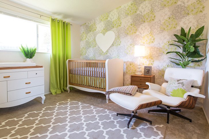
Photographed by Full Spectrum Photography for Little Crown Interiors.
This designer definitely went for a modern look. Ironically, this neutral nursery is the least neutral room in the house design wise. "[The client] knew she wanted a fun wallpaper and a design that really popped since the rest of her home was more neutral,” explains Alon. The mid-century modern motif is a fresh take on a nursery (though it’s been a trend in home decor for some time). How cool is this kid going to grow up to be?
Neutral Nursery Theme #4: Sweet Safari
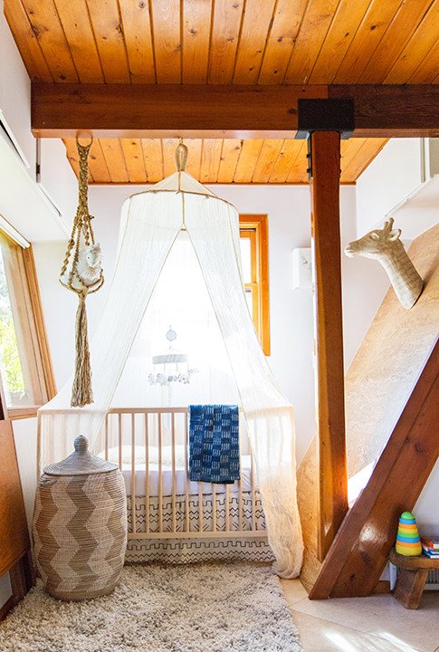
Photographed by Tessa Neustadt.
One of the most visually interesting parts of this sweet safari design is the architecture of the room itself. The designer really made use of a tough,small space! But even if you don’t have this cool woodwork in your house, you can still create a lovely safari nursery theme with a white canopy, earthy, natural colors, and global accessories. Just make sure the safari animals you include are friendly and not too scary for your little one!
Neutral Nursery Theme #5: Night Sky

Photographed by Full Spectrum Photography for Little Crown Interiors.
Babies spend most of their time looking up from their cribs, so try a ceiling mural like this night sky one by Little Crown Interiors. Alon was tasked with creating a room around a wall hanging her client had brought home from vacation, which is where the safari theme comes into play. But the real focal point of the room is the night-sky ceiling, which uses recessed lighting to mimic shining stars.
Neutral Nursery Theme #6: Woodland Wonder

Photographed by Don Molyneaux for Neelam Interiors.
One of the most popular neutral nursery ideas right now is to paint the walls gray, as seen here in this woodland wonder-themed nursery. Neelam Gurm of Neelam Interiors says gray is the new yellow when it comes to nurseries. But Gurm didn’t go with a simple wall for this mountain-themed nursery.
The bold, geometric mural of snow-capped sets a fun and modern tone for the room, which she then accented with adorable woodland creatures like the moose. The pulls on the dresser are actually little bunnies – how cute!
This design showcases Gurm’s top tips for creating a gender-neutral nursery: Incorporate a wall mural inspired by nature and artwork featuring animals.
Neutral Nursery Theme #7: Around The World
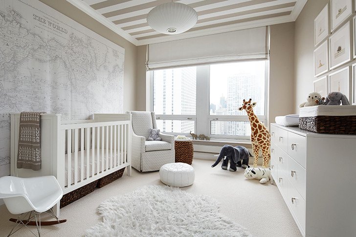
Courtesy of Gemma Parker Design.
Instill a curiosity for the great big world and a love of travel at a young age by sending your kiddo around the world within their own room. This nursery theme by Gemma Parker-McKeon, founder of Gemma Parker Design, features an antique atlas — a chic and affordable way to do large-scale wall art. You’ll notice the theme is subtly incorporated throughout with the legs of the rocking chair, which resemble a vintage airplane, and stuffed animals from around the world.
The room also exemplifies her the designer’s philosophy for designing neutral: “Start with a classic base and add an unexpected twist, whether it be a large graphic element or a striped ceiling," she says. "Make it unique and playful in a way that will grow with the child."
Neutral Nursery Theme #8: Seafaring Explorer
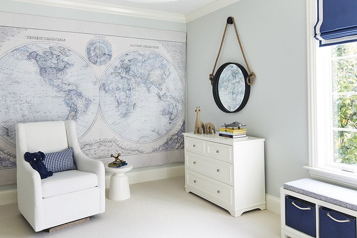
Courtesy of Gemma Parker Design.
Another nursery idea by Parker-McKeon also features a map of the world as the focal piece of the room, but this time, we’re getting a seafaring explorer vibe. Soothing navy and white colors and that nautical rope accent on the mirror create a modern ode to the age of exploration.
“These clients were very well traveled and lived all over the world, so these wall tapestries were a great design element,” Parker-McKeon says.
And while navy blue is typically associated with boys, the white base makes the room gender-neutral.
Neutral Nursery Theme #9: Far Off Lands

Photographed by Lance Selgo for EJ Interiors.
This nursery idea gives a playful nod to travel and exploration with a directional sign post pointing to far off lands like Mount Kilimanjaro. The graphic wallpaper and the bold clover green dresser make you and baby feel like you’re in the far east. But the inspiration actually started with the client reading a magazine, says designer Emily Johnston Larkin, owner of EJ Interiors.
“She had seen an article on ‘clover green’ in a fashion magazine, gave me the article, and said she wanted her room to have pops of that color,” Johnston Larkin shares.
Neutral Nursery Theme #10: Amalfi Coast Sophistication

Photographed by Christopher Stark for Dina Bandman Interiors.
The baby that lives here has an air of Amalfi Coast sophistication. This classic nursery theme is perfect for a traditionally decorated home home. Modern details like the very unique crib, side table, and light fixtures make the room feel light and fun for a child. And, of course, check our that ceiling! The design by Dina Bandman of Dina Bandman Interiors was inspired by a trip to Italy.
“The inspiration for this particular room drew from the Amalfi coast, where I could not resist purchasing every lemon shaped ceramic,” she explains. “When [the client] approached me to design a wallpaper, I had already envisioned designing a nursery and wanted it to be suitable for a boy or a girl. Instinctively, my thoughts went to a color palette of green and yellow — the same colors found in a lemon tree — and from there the room just grew.”
Neutral Nursery Theme #11: Counting Sheep

Photographed by Marissa Moss Photography for Hendrickson Interiors.
This pristine white nursery by Hendrickson Interiors will have your little one counting sheep. This room is innocent and pure. You’ll notice little sheep and other critters throughout — in the frames on the wall and little plush toys on the shelves. The good thing about an all-white, minimalist nursery theme is that if sheep aren’t your thing, you can choose any details you like.
Neutral Nursery Theme #12: Coastal New England

Photographed by Don Molyneaux for Neelam Interiors.
This neutral nursery is actually found in a home in Alberta, Canada, but designer Neelam Gurm really nailed the coastal New England vibe. Don't you feel like you’re in a fishing village in Maine? The shiplap wallpaper really sets the tone for the room and details like the captain’s wheel and plush whale really drive the theme home, but in a subtle and sophisticated way.
Neutral Nursery Theme #13: Shades Of Blue

Photographed by Maria del Rio.
The focal point of this nursery is, of course, the tie-dye style wallpaper in shades of blue. Adding a bold visual element like that may seem daunting, but it actually frees you from having to do much else in terms of decorating! And the deep shade is a surprising departure from the pastels you normally see in a nursery.
While this room is blue, it’s a great neutral nursery idea. “I think you can have both pink and blue in a gender neutral nursery,” says Corre Marie Larkin.
Neutral Nursery Theme #14: Natural Habitat

Photographed by Erin Kunkel.
This is a very simple nursery design with clean lines and neutral colors will become your baby’s natural habitat. It’s perfect for parents who like a modern, Scandinavian aesthetic. You can really go anywhere with this base, but this designer focused on animal friends to bring a bit of whimsy and playfulness to the space.
Neutral Nursery Theme #15: Boho Baby

Photographed by Monica Wang.
Macrame wall art, check. Tie-dye area rug, check. Leafy greenery, check. Boho baby? check. This neutral nursery has all the makings of a bohemianparadise for your little one. This simple room is just white walls and hardwood floor, but by adding a few surprising elements for a nursery, the space now has a very defined personality while remaining gender-neutral. This baby is chic.
Neutral Nursery Theme #16: Surf’s Up

Photographed by Heidi’s Bridge.
Surf’s up in this California cool nursery! You can take inspiration from where you live when creating a theme for your gender-neutral nursery. By adding photographs of surfboards and SoCal bungalows above the crib along with sweet blue bedding, the designer has instantly (and very easily) created an identity for this nursery.
Nursery Theme #17: Very Vintage
Photographed by Nicole LaMotte.
These vintage toys of yesteryear make for adorable art around a baby’s room. Not only does it add a childlike playfulness to the nursery, but they are actually stylish design elements that parents will appreciate as well. It can be fun to hunt around flea markets, estate sales, online retailers like 1stdibs and Chairish, and even in your family’s attic for these timeless pieces.
Neutral Nursery Theme #18: Western Fairytale

Photographed by Nicki Sebastian.
Eclectic, whimsical, unique, and quirky are all adjectives one could use to describe this western fairytale of a nursery. It’s like the wild west through the looking glass. While this particular nursery has some feminine touches like the flower pouf and pink horse, the base is gender-neutral and totally fun for any kiddo.
Designer Naomi Alon says, “You can always design 90 percent of the room as gender neutral, and then add in little extra accessories like blankets, picture frames and wall art once the baby comes home to make it personal for them.”
Neutral Nursery Theme #19: Gray Gardens

Photographed by Claudia Uribe.
Soft tones has been having a moment in home decor for some time, but this neutral nursery idea pumps it up a notch with a gray garden design. Playing off the leafy pattern, the designer has added some little woodland creatures and a pop of color with fresh tulips. After all, if you want your baby to feel like they are in nature, why not actually bring some in?
Neutral Nursery Theme #20: Warm Tan

Courtesy of Melanie Stewart Designs.
Yes, gray is the neutral color of the moment but there’s nothing wrong with a classic, warm tan! Melanie Stewart of Melanie Stewart Designs created this simple neutral nursery when she was pregnant and didn’t know if she was having a boy or a girl. She decided to create a neutral theme that she could add items to once the baby arrived.
“I focused on playing up textures versus on color," she shares. "Keeping a room gender neutral for me is about focusing initially on keeping the ‘base items’ simple and neutral."